Pin It button on image hover

Friday, August 2, 2013

Picture Frame Moldings and a Kitchen and Dining Makeover

One easy way to add some architectural detail and interest to a house that might be a bit dated or a bit "builder's grade" is with molding and wainscoting.


When we moved into our house, every single room on the first floor was a yellow / peach color.  Although the kitchen and dining room had been remodeled only five years earlier, there was no contrast.  The cabinets were a light maple color, the backsplash tile was a Harlequin pattern of light and dark beige, the floors were a light maple Pergo, the curtains were beige and brown, the fridge was almond.  The existing baseboards and trim were an off-white that was very close to the wall color.  Everything just ran together.


One of the changes we made to the house early on was to paint the kitchen and dining room.  We took painting one step further though and decided to add some detail and contrast by adding picture frame wainscoting in crisp white as well.  The wall color above the molding is Valspar Voyage - it's a bluish gray that really brought some much needed contrast to our kitchen and dining room and toned down the yellowness of our cabinets and floors.  Depending on the lighting it can read very blue but in real life I think it's closer to the color in the bottom picture than above.


The paint and moldings made a huge difference, so did changing out the chandelier.  The one in the first picture the original owners actually took with them and left us with an slightly less sparkly brass chandelier that I spray painted white and hung in my daughter's room upstairs - it's actually really cute there.  In the dining room, it was not my thing.  The new stainless refrigerator also made a huge difference compared to the old almond one.  So sad that I'm taking that beauty with me to Texas.  I'm also going to miss all that cabinetry... This kitchen has so much storage!


I'm a big fan of painting any and all trim a crisp bright white, it can make such a huge impact.  We were lucky and we had smooth walls, if your walls are textured, you will probably want to do a piece of MDF before you put up the molding or it's not going to give you the same effect.  In our next house, we'll be doing the MDF first.


We painted the walls under the chair rail, the base boards and the chair rail (as well as all the door and window frames) bright white.  We used Valspar's semi-gloss in Ultra White.  Paint the walls first so you can just roll everything on.  It will be so much easier.


Next we bought some thin picture frame molding and started planning out our boxes.  We adjusted the measurements to fit our space.  We kept all the spaces in between the boxes, between the baseboards, chair rail and any windows or vents that we had to go around equal so that even if we varied the size of the boxes it didn't look random.  It really helped it look much more consistent.  Our spacing between the baseboards, chair rail and boxes and other fixtures was approximately three inches.  We used a laser level to mark the horizontal lines with painters tape and then measured the length of the wall, figured out how many boxes we wanted and then add the space in between and divided the total remaining inches to figure out where to mark the vertical spaces.  Just my advice, but it really helped us to draw it out on a piece of paper to do the math, it made it much easier to visualize.


We primed and painted all the trim pieces before putting them on the walls.  Then once we had everything attached, we caulked any seams and filled any nail holes, then touched up the paint.

Don't skip the caulk - it will really help you get professional results.  Without caulk, you see any imperfections in your walls (they aren't ever perfectly straight), any bad miter cuts you might make, etc.  We like to use the DAP paintable caulk to finish everything off.  Just apply a thin bead, then smooth with your finger.  Once the caulking and spackle are dry, lightly sand any necessary areas to smooth everything out and then touch up your paint.


Friday, July 26, 2013

Madeleine's 1st Birthday


My youngest daughter, Madeleine, turned one at the end of May.  How that's possible, I have no idea.  It doesn't seem possible that she could be a year old and now she's almost 14 months old and I still have a hard time saying she's a toddler and not a baby!


For her first birthday, we planned a "cute as a button" celebration.  Since we all know that 1st birthday parties are really for the parents anyway since one year olds don't really care what they do, I came up with this one early on.  I found a button cake on Pinterest a long time ago -- probably sometime while I was pregnant with my first baby.  I filed it away and thought nothing more of it until I was pregnant with Madeleine.  Then I thought about using it for a baby shower but didn't have an opportunity to throw one and then I decided it would make a great theme for a birthday party as well.


The cakes are both traditional vanilla birthday cake - you can find the recipe on this post, but it's a slightly adapted recipe from the Magnolia Bakery cookbook.


This was a pretty light theme, we had cute as a button cookies, a button cake, and a few decorations but we also just had a great summer birthday party and let the kids play outside and tried not to go overboard on decorations and such.


For the main button cake, I covered it in homemade marshmallow fondant, and then made little button cutouts out of pink and yellow fondant to decorate the cake and add to the sugar cookies as well.  Marshmallow fondant is really easy to make and simple to work with.  You can find my recipe as well as some tips on this post.   If you want another example, check out this post from Aubrey's 2nd birthday party for a look at her Sesame Street cake.

For food, we did a self-serve burger bar and grilled up beef and turkey burgers and offered tons of choices for condiments.  We had the standard ketchup, mustard, pickles, and cheese but also offered more fun toppings like chipotle mayo, sriracha sauce, jalepenos and banana peppers, grilled pineapple, and crispy bacon.


We had a variety of chips and dips - a hot and spicy corn dip, hummus and crackers, and guacamole, because we don't have parties without guacamole.  We had a vegetable platter and fruit salad as well.


For desserts, we had cookies and cake and homemade vanilla ice cream.  The cookies are my normal sugar cookie recipe - these are so easy to make and you can make the cookie dough ahead of time and freeze it to save time for the party.  You can also bake the cookies in advance and freeze if you prefer but I would recommend waiting to frost and decorate until closer to party time.  I always like to do mine within a day or two of the party and then store between layers of parchment paper once the royal icing is completely dry (overnight) in an airtight container.   You can find the recipe in this post.

Of course, I made Madeleine her own smash cake.  She had some fun getting into the icing and cake but wanted nothing to do with the cold ice cream.  A few weeks later she tried it again though and decided it was pretty good stuff so rest assured, she's a normal kid!  For the smash cake, fondant isn't really practical.  It's too hard for the little ones to get through so I always stick with a simple buttercream icing.  I also tend to put it on pretty thin so it's not quite as gooey for them.  Also make sure you don't decorate with anything that could be a choking hazard.  I used the large thin candy wafers on this one.  They basically dissolve in your mouth and break up really easily.


Thumbs up for cake!  

Happy birthday baby girl - I can't believe you're already a toddler.  The first year was so much fun and the days just keep getting better.  You and your sister are the best of friends and you are the sweetest little girl.  I'm so thankful everyday to be blessed with two beautiful, happy, healthy baby girls.  I love you with all my heart sweet birthday girl!


Wednesday, July 24, 2013

Master Bathroom Remodel

Continuing with our home remodel tour, probably the most dramatic change we've made to the house is our master bathroom.  This one was a total demolition.  The only thing we kept in the entire space was the toilet and door.  The rest of it wasn't salvageable.


To rid the bathroom of the 1970's, it took a bit more time and money than most of projects have been.  This has definitely been our biggest undertaking to date and I think it took us about 8 weeks from start to finish, although during some of that time, there wasn't any progress being made since we were waiting on our contractor and then waiting on the custom counter top to be manufactured.  Because we changed our minds a couple of times throughout the process on the plan, we didn't build in as much lead time as we should have for some of the custom items.  Just remember that in remodeling, "custom" equals more time and more money!

Our bathroom was set up with the toilet and shower "cave" in one small room and a vanity with a huge mirror up the ceiling in an alcove of the bedroom instead of behind closed doors, complete with carpet and giant swagged pendant lights, one of which didn't even work. On the other side of the vanity was another door leading to the walk in closet, which we also updated to make it much more functional.


Taking the bathroom down to the studs and subfloor, we brought in a contractor to do the heavy lifting on this one.  We didn't want to experiment with major plumbing work and we needed to flip flop the vanity and shower so we could make room for a bathtub and a double vanity. We ended up doing a deep soaking tub with a glass tile shower surround and an L-shaped vanity to maximize space. Because we don't have any windows, we went with white marble floors and vanity top to keep it light.  We were able to find a contractor who was willing to let us do what we were able to ourselves to help us keep the costs down.  He did the new wiring and plumbing, in addition to framing out the new wall and door frame (we had to move it over about 6" in order to have enough room for the vanity) and taped and mudded the drywall.  We did the demo, installed the cabinets and counter top, hung the drywall, tiled the floor and shower, painted, installed lighting and plumbing fixtures and reinstalled/replaced all the trim and doors.

We worked with the designer at Lowe's to help us come up with the L-shape vanity and bathroom layout.  We were initially going to just do a straight double vanity and squeeze in double sinks in the same place as the original vanity and put the shower and tub where the long part of the L-shape vanity was, but we wanted a frameless glass shower door around the tub and shower to keep it from feeling like a cave when you came through the door and that custom job was way out of our price range.  We considered a few other options, a half wall with a window of sorts, glass block, etc and we just didn't really like any of the options.  Unless we scrapped the tub addition, one of the major must-haves for this remodel, it just wouldn't work without moving plumbing.  When the Lowe's designer suggested the L-shaped vanity, something we hadn't really seen before, we were quickly sold on the idea.  Not only did we gain more storage and counter space but it made the bathroom feel much more open.


The cabinets are semi-custom from Lowe's - we used the Insignia line and ordered the Crest door style which is a very clean Shaker style cabinet in the Java color.  They are a rich dark brown, although they look almost black in these photos.  We added hardware in chrome to coordinate with the faucets.  The doors and frames are solid wood construction and you can order many different configurations.  We did two 30" base cabinets and a 12" drawer bank and needed 2 3" filler pieces to form the corner.  That does mean that there is nothing in the corner, it would have been great if we could have utilized that space, but we couldn't find an option for a corner bathroom cabinet without having someone build the entire unit from scratch which would have likely been much more expensive.  We had the counter top made to our measurements including choosing sink placement and style and materials and ordered from Marble Arch through Lowes.  We did end up paying more for the L-shape counter than we would have for the same amount of linear feet of counter in a straight run but it was worth it for us to maximize the space in the bathroom.

We could have gone back to the glass shower door idea at this point but that was still a stretch for our budget, especially now that we had the additional cost of a plumber and electrician added to the remodel.  We ended up having to move the floor drain, run new lines for the sinks, and put in plumbing in the new wall for the shower and tub.  We chose glass tile on the shower surround and chrome fixtures to add more shine and a little color to the room. But just in case you like it, let me warn you how much of a pain it is to install glass mosaic tiles... big tiles are so much easier.  Although the tiles come on 12x12 sheets of 1" square tiles, we found them quite difficult to work with since they slid around on the mesh backing.  Maybe it was just the particular brand of tile, but we had a difficult time keeping the rows straight.  Next time, I'm planning to use my other favorite, subway tile. 


I love porcelain and chrome fixtures and lots of white in a bathroom so the solid white counter tops and white ceramic tile floors were an easy choice.  The floor tiles are 18x18 white ceramic with gray marbling that looks very much like Carrara marble without the price tag, I believe these were somewhere in the $5 per square foot range.  I believe this is the same tile, if it's not the exact same, it's very close. The white tile and counter tops really make the room feel brighter and larger since there is no window, we didn't want it to seem dark by using dark floors as well.  To finish off the bathroom, we painted the walls a deep gray color - Silver Charm by Valspar and added fresh white trim.

For the final touches, we added a chrome curved shower pole, definitely not going back to a straight curtain pole in the future, it's amazing how much bigger the shower feels with that extra bit of space.  The shower curtain is from Target and is no longer available.  If I was doing it again, I would definitely buy an extra long curtain since I don't love where this one hits the tub, it's about 6" too short.  The faucets are all from Overstock.com and the light fixtures were from Lowes and we bought the shades separately.  The frameless mirrors are from the Home Depot.  I originally wanted the mirrors that stand off the wall, like these from Pottery Barn, but in the end, we wanted something a little bit more budget friendly and opted to save about $300.  Our plan was to frame them out down the road to match the cabinets if we changed our minds but so far, we really like them.


We didn't do much for accessories in here.  I added a little homemade art over the toilet.  I started by downloading a printable image of Kentucky set on gray and white stripes from Pinterest and dropping a heart on Louisville in PicMonkey and printing it in poster size and framing it with an Ikea Ribba frame.  We picked up the chrome wire baskets at Target and stacked them, rolled up some hand towels and use them for storing our "prettier" bathroom items, including a couple of old blue mason jars that I found in my grandpa's basement and filled with q-tips and cotton balls.  Everything else gets stashed in the vanity cabinets.  I've had that blue sea glass vase for ever and stole it from the living room to add a little more height to the counter.  I still think we needed something else in that corner but we never figured out what to put there.  I think if we would have stayed in this house longer, I probably would have eventually ordered the corner hutch from our cabinet maker to add a bit more storage and better utilize that space.  The towels we already owned but they are from Bed, Bath and Beyond.

Tuesday, July 23, 2013

Madeleine's Nursery Makeover

Another classic 70's room, this one soon became our youngest daughter, Madeleine's, nursery. Her room is the smallest bedroom upstairs but the updates made it feel a lot bigger than it was before. It started out covered in some great wallpaper, in fact two different wallpaper patterns, airplanes on two walls and green paper paneling on the other two walls. The addition of green trim and doors really made for an ugly room.  As an added bonus, under that layer of wallpaper was some additional green paint and a lovely pink tulip wallpaper border, just in case the first layer wasn't enough.  The dresser that you see in the picture was left in the basement, along with a bedframe that was painted to match.  I really liked the simple lines of the dresser and it was still in good condition, although ugly, so I decided to refinish it to match the cherry crib we picked out.  Looking back at these before pictures, it's hard to believe it's the same room.


We tried several different methods removing the layers of wallpaper and we had the best luck with a combination of a steamer and a wide putty knife to help scrape the stubborn spots.  If one of us used the steamer and the other closely followed to peel the paper immediately, it came off pretty well.  The border actually took us about the same amount of time to remove as all of the airplane and paneling wall paper because they must have used a much stronger glue.  The airplane wallpaper was pretty heavy and came off in pretty good size pieces.  Thankfully we were able to get it down without too many issues and it didn't leave a lot of damage to the walls.  What spots we did have, we patched with a little spackle, smoothed, and sanded before painting.

While the renovation took a lot of time, it really didn't take a lot of materials - a couple gallons of paint, a new ceiling fan (which we already had from another room in the house), a new organization system to make the closet more functional and some furniture and it has become a great nursery for our little girl.


Luckily, the hardwood floors were in great condition so that was a good starting point for us.  We painted the walls a neutral gray and that really lightened everything up.  Repainting all the trim and doors to white makes such a huge impact.  I made the curtain panel out of some pink damask remnant fabric that I picked up on clearance for $5 by adding a simple hem all the way around and a rod pocket at the top.  


Her bedding is a combination of several different pieces. We went with solid pink crib sheets. A super soft minky baby bumper (which we took out when she was little and used a breathable bumper in it's place due to the risk of soft, fabric bumpers) from Carters.  


The striped crib skirt was a last minute find from the Pottery Barn Kids clearance section, I was originally going to make one but a) I'm not really that good with a sewing machine and b) the fabric required to make the ruffled skirt I wanted was going to cost as much as the ruffled PBK ones that I was trying to avoid buying, so when I found this cute simple one for $14.99, I jumped on the deal, it's from the Sophie collection. 


 The quilt and pillow are from the Pottery Barn Kids Vienna nursery collection. The rocking chair and ottoman are from Babies R' Us and have been discontinued but they do have a lighter grey similar rocker available currently. The grey rug is a solid grey carpet remnant rug that we found at Lowe's I believe. The lamp base and shade are both from Target and the table is from a set of nesting tables that we've had forever that I painted white.

The "M" on the wall is a simple wooden letter that I ordered from Craftcuts - they sell all different sizes and fonts - and then hotglued buttons all over.  It took me until her first birthday party to actually get it decorated, I may have just hung it unfinished on the wall for the entire first year until we threw a "Cute as a Button" birthday party and I borrowed it for decor to hang with on the wall in the kitchen.  I just bought a bag of random sized buttons at Hobby Lobby for around $5 and glued them on in layers.


The shelves were prefinished boards from Lowe's along with brackets sold in the closet/organizing section and all the picture frames are Ribba frames from Ikea.  The elephant painting on canvas I painted at Uptown Art and the elephant print with the balloon is from TrafalgarSquare on Etsy.  All the photos are by Dede Holman Photography.  The large elephant stuffed animal is from Pottery Barn Kids a while back as well.  The mobile is from Ikea, the pink organizing basket on the shelf is from Babies R' Us, and the picture frame and stuffed bear were both gifts so I'm not sure on sources for those.  

The dresser was refinished by stripping and sanding off all the original paint and then we finished it with a natural walnut stain that included poly.  I added a little cherry stain to the walnut to give it a bit more red tone when I was trying to match the crib.  I ended up putting on four coats of stain and it's a pretty good match.  I probably could have done one more but like most projects, I ran out of time and patience.  We added some glass knobs from Lowe's and I think it turned out perfectly.  It's a perfect size for a nursery.  The changing pad cover is from Munchkin at Target.  We added the screw at the back of the dresser to secure the changing pad to the top of the dresser.


Monday, July 22, 2013

Easy Striped Half Bath

Hello... anyone still out there... This year has been a bit of a whirlwind.  Not that it's that much of a change from normal as I seem to always be in the middle of something.  But do to some pretty life changing events, we'll be busier than usual again for a couple of months.  After only a brief two years in our current home we are moving once again, this time a little further down the road to Texas!  It's been a long time coming so we were incredibly excited when we were able to get new jobs and make it happen.  Before we leave this house though, I want to share some of the remodels that we have done.  We have put a lot of time and effort into transforming our 70's era house and looking back at these pictures really makes that apparent.

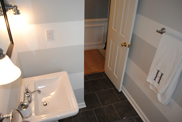
Up first, the half bath on the main floor.  Since our house is about 40 years old, the bathroom was a typical small tile floor but also came with the added bonus of really bad sconces, mirror and a vanity with several coats of paint and even some "bars" spanning from half wall to ceiling to block the toilet from view. We found some great wallpaper that had been painted over as well.


We pulled everything out, took a sledge hammer to the tile floor and started from scratch.  

Adding some wide gray and white stripes and dark gray floor tiles modernized the room and we took out the half wall and vanity to replace it with a pedestal sink to make it seem much bigger.  Because we didn't have to move any electric or plumbing, it went pretty smoothly and was also a cost effective renovation at only a few hundred dollars worth of materials.


My favorite part of this room are the wide stripes, I really want to do them again.  Not something that my husband will be thrilled to hear I'm sure seeing as he's the one that did the majority of the painting.  One of the perks of being pregnant during a remodel.


The key to painting stripes for us has been this foolproof method.  First paint the base wall color.  Then tape off the stripes.  Once the tape is up, paint the same base color over the inside edge (i.e. the edge that will become the stripe color) with the BASE color.  This will ensure that any bleeding that will happen will be with the base color and therefore won't show.  After that dries, then paint the stripe color.  After the second coat, if needed, remove the tape while the paint is still wet.  Perfect stripes!


Sources: 
Floor Tile - The Tile Shop
Sconces - Portfolio brand - no longer sold - Lowes
Pedestal Sink - American standard - Lowes
Towel Bars, Toilet Paper Holder - Lowes
Soap Dispenser - Target
Towels - Monogrammed - Bed Bath & Beyond
Rug - Target


Saturday, June 15, 2013

A Book Baby Shower

My little sister is having her first baby - literally any day now - and we had an absolutely adorable shower for her a couple of months ago.   Yes, it was in April, and I'm just now posting about it - it happens.

I started out on Pinterest to find some ideas and quickly had about four different themes planned when I realized that they all revolved around children's books.  Reading with my kids is one of my favorite moments of the day and they both love books.  I hope that Nikki will enjoy reading with baby Colton just as much and we wanted to get her library started for him.

I love how this shower turned out and was so happy to get to throw it -- now I just can't wait to meet baby Colton!!


I took a few shortcuts with the food on this shower since I was travelling by plane to get there.  We ordered the cake from a bakery and everything on the menu was quick and easy to prepare.


For the invitations, I just put together some images of the characters in several of the books we were using.  I made coordinating signs for each of the dishes on the menu as well to tie the food into the book theme.

The menu and book pairings included:

Sam I Am's Green Deviled Eggs - complete with the egg whites dyed green instead of the egg yolks - based on a Pinterest tutorial I found here, you can dye eggs any color you want and it doesn't affect the flavor at all.


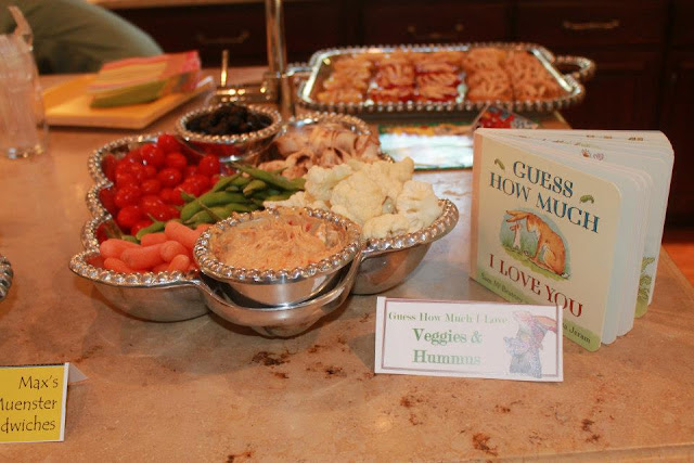
Guess How Much I Love You Veggies and Hummus - it was a stretch but it's "bunny food" and I love this book.


The Very Hungry Caterpillar's Fruit and Yogurt Dip


Where The Wild Things Are & Max's Turkey "Muenster" Sandwiches - a simple sandwich with shaved turkey breast, muenster cheese, baby spinach and mustard.


Cloudy with a Chance of Meatballs - with a quick chili sauce and grape jelly sauced meatball.


If You Give a Mouse a Snickerdoodle - we subbed in Snickerdoodles since they are my sister's favorite.


Jamberry Pies - if you've never heard of the book Jamberry you should look it up, such a cute rhyming story.  I made mini cherry, lemon and apple pies in a muffin tin taking some help from refrigerated pie crust for this one.


And from Giraffe's Cant Dance, Gerald's (non-alcoholic of course) Jungle Juice.


We also used Good Night Moon as a guest book, asking guests to leave a message for Mom or baby.


I made a simple diaper cake and added signs from the book Little Blue Truck and found some animal baby toys to add in for extra fun.


One of the best things about the baby shower was the onesie decorating station we set up outside in lieu of playing traditional shower games.  We had so much fun decorating onesies with fabric paint and stencils and iron-on transfers and they turned out so cute!

Related Posts with Thumbnails